Set Designer for Orpheus and Eurydice
In a conversation over Zoom, Orpheus and Eurydice’s set designer, Carey Wong, sat down with Seattle Opera to discuss how he got started in opera, his vision for the Orpheus sets, and what excites him about the future of theater.
Carey Wong has worked for over 45 years as a stage designer and arts administrator in the United States, Canada, and abroad. He has designed sets and/or costumes for over 300 productions of operas, plays, musicals, and ballets, as well as art installations and themed environments. Currently a freelance designer and theater consultant based in Gig Harbor, Washington, he began his career as General Production Manger and Resident Designer of Portland Opera for eight seasons. This was followed by two seasons as Artistic Administrator and Resident Designer at Opera Memphis. While at Portland Opera, Mr. Wong designed sets and costumes for 12 new productions including the American premiere of Ernst Krenek’s Life of Orestes (in an English translation by the composer commissioned for the premiere), the world premiere of Bernard Herrmann’s Wuthering Heights, and a rare staging of Carl Maria von Weber’s Der Freischütz. Three of his Portland productions were shared by Seattle Opera.
Seattle Opera: How did you get involved in designing sets for theater? And what attracted you to opera, specifically?
Carey Wong: That's a good question. I originally went to college to be a mathematician, and I liked the puzzle-solving quality of that. But I realized early on that I probably wasn't going to be a great mathematician, so I started experimenting with other classes—dabbling in psychology, English literature, and film. I ended up becoming very interested in historical recreations of plays. My senior thesis in college was to reconstruct a historical masque by [17th-century playwright] Ben Jonson, and that got me interested in stage design.
I got into opera after I left school, when Portland Opera hired me to design a show for them. We didn't have a lot of money at the time, but we had great aspirations and great energy. And our performance venue was Keller Auditorium, which is a big stage. I consider that my graduate school: I learned by doing, and it was a great way to hone my craft and figure out how to allocate resources and what the practical necessities are.
The great thing about opera is that the addition of music really allows you, as a designer, to create much more expansive, conceptual visions than you might be able to create for spoken theater. Theater can be very reality-based—a lot of the time, you’re creating a contemporary living room, or a gas station, or whatever. But in opera, you're often dealing with larger visual gestures and larger possibilities, or even sets that function on the level of metaphor. That's the exciting thing about working in opera: you can engage the visual senses not only in a richer and more enveloping way, but also in an intellectual and conceptual way.
I think opera audiences are often quite interested to see what the production or the mise en scène is going to be for a particular production. And Orpheus and Eurydice is such a compelling piece that offers a lot of different visual possibilities that it's a wonderful chance to play with an environment and create something novel.
Seattle Opera: Yes, let's talk more about some specifics of the set design for Orpheus and Eurydice. What were your fundamental ideas for how the show should look?
Carey Wong: In a piece like Orpheus, it was very clear from the beginning that projections would play a large role in the visual storytelling. So it was my job to create an environment that not only had an interesting shape to it, but would be a surface on which the projections could have a life of their own. And because Chía [Patiño], the stage director, was really interested in the idea of the Fates spinning the thread of life—creating a thread that is spun, measured, and cut—we found a material that looks like a spider web that covers all of the surfaces of the set. It gives the set the feeling that it is being enveloped by the threads of time. That world of woven and ripped and shredded and tangled threads is an apt visual metaphor for the show, in which Eurydice's life has been cut short.
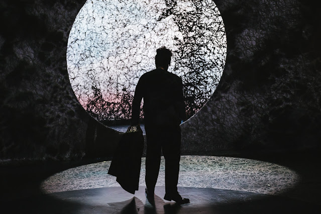 |
| The "threads of time" are woven over the entire surface of the set. Credit: Sunny Martini |
Seattle Opera: Could you tell me about how your vision for the sets morphed over time? I’ve heard you mention that it looks quite different now than it did when you first generated ideas.
Carey Wong: One image that Chía [Patiño] had early on was of this circle of light in the midst of darkness—like a beacon. Initially, I had created a couple of different sets that had a large, circular opening at the back of the stage. But we realized that although the circle of light was a focal point that needed to be incorporated in the design, it shouldn’t be so big that it overwhelmed the visual picture. So we ended up creating a much smaller circular opening with a larger drop space where projections could occur.
Additionally, I always wanted to have a slightly skewed set, to show that Eurydice's death threw the world out of balance, and so I was trying to play with something that was somehow tilted or slightly askew. That was somewhat apparent in the first designs, but not as emphatically apparent as in the final design, where the world is very askew. We created a very large, tipped wall—a wall that almost looks like it's going to fall on the audience—with three very tall openings and forced perspective.
I think this juxtaposition of a very small, circular opening that reveals itself against this large, looming wall tilted at an extreme angle creates a dramatic visual tension that will help serve the show really well.
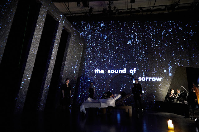 |
| The tilted walls of the set hang over the performers on stage. Credit: Philip Newton. |
Seattle Opera: Absolutely. [Stage director] Chía [Patiño] clearly has a strong vision for this show, and she's starting with a story that is quite old and has been adapted time and time again. How do set designs and the other visual elements of an opera like this help to reinterpret an old story and make it fresh for new audiences?
Carey Wong: I think our production looks very contemporary—it doesn't look like a Baroque opera or anything that has remnants of 16th-, 17th-, or 18th-century scenery or costumes in it. And I don’t want to give anything away, but I think Chía's interpretation of the story is very contemporary because it questions the nature and degree of Orpheus's love of Eurydice. I think that puts the relationship in a more modern light.
Seattle Opera: I would love to hear more about what it's like designing sets for such a small, intimate space as Tagney Jones Hall. I'm thinking of how dramatic it's going to look to have tilted architecture when the audience is literally right there, with the sets maybe even looking like they're going to fall right on them.
Carey Wong: One of the major challenges has been that the hall is a finished space, so we can’t drill holes into the walls or insert bolts to hold things up. As a result, I think the crew who built the set have had to be fairly clever and nimble about how they've chosen to build the scenery. For example, the tilted wall that we’ve been talking about—the one that looks like it's going to fall on the audience—it's actually self-supporting. We originally thought that we would have to suspend it from the grid, but then [Scenic Studios Manager] Michael Moore was able to figure out a way to weight it from the ground, so it wouldn't need to have overhead support.
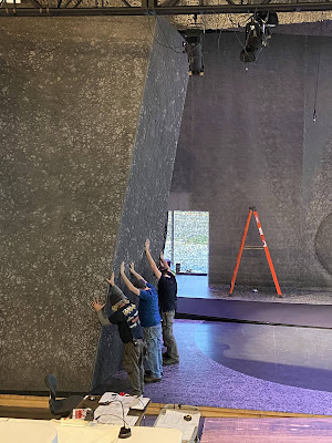 |
| The Seattle Opera set crew installs the tilted wall in Tagney Jones Hall. Credit: Arryn Davis. |
It's been fun, working in this space. It's that whole thing about puzzle solving: it's like a mathematical problem, except it's a visual challenge to solve.
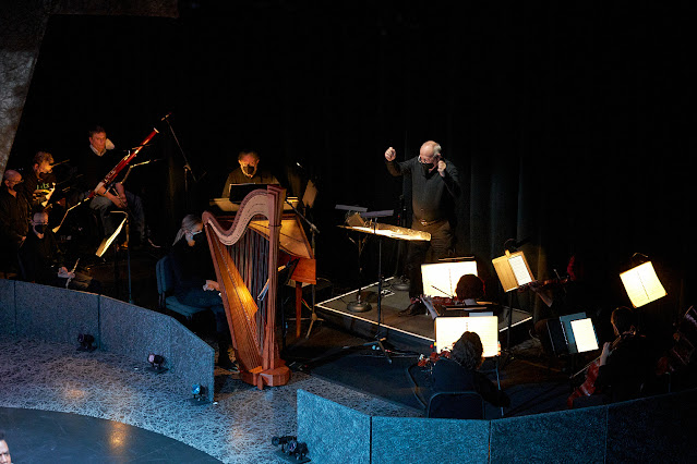 |
| The arrangement of the orchestra to the side of the stage. Credit: Philip Newton. |
Carey Wong: I would say this: that small, circular opening that's in the set has a couple of different intended looks to it, and I'm hoping those will be somewhat surprising for the audience. We don't have the ability to fly sets in and out of this small venue, so it's hard to change scenery—but we've come up with a couple of things that I think will alter what people see in the opening.
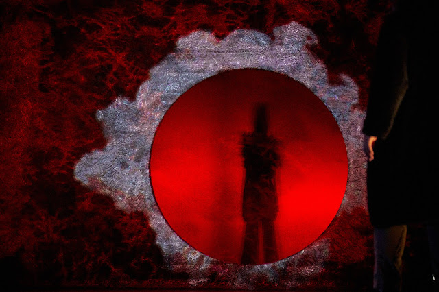 |
| The circular opening at the back of the stage glows with the light of S. Katy Tucker's projections. Credit: Philip Newton. |
Carey Wong: That's a good question. I think that, a lot of times, people think that set designers are people who just come up with pretty pictures or interesting ideas, and everything is just created from a simple sketch or a simple idea, and, poof, it's all magic. The thing I think people don't realize is that there is a great deal of precision and work involved in what we do, as scenic designers and costume designers and lighting designers.
As a set designer, for instance, I have to come up with an idea. Then, I usually have to build a model for it, at scale. (A half-inch scale is what I use.) And then I have to do architectural drawings of every piece of scenery, from all sides or from different views. Those drawings go to the scene shop and they look at it and cost it out. More often than not, scenery has to be edited down because the resources that are available for the project don't equal what the designer has in mind, and there's a lot of back and forth to that process that I think a lot of people aren't aware of.
And a lot of times, as a designer, you can delete extraneous details that might embellish the story or tell the story a little better or be prettier or be more dramatically compelling, but you're still going to be able to maintain a look and an idea, a concept and a vision that will work for the storytelling.
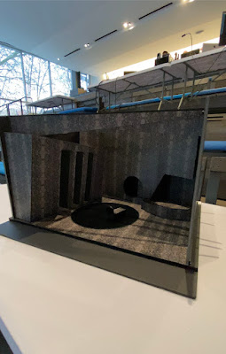 |
| Carey Wong's scale model for the Orpheus sets. Credit: Arryn Davis. |
Carey Wong: The pandemic has made it really tough for live performing arts, and yet, it has spawned all kinds of hybrid forms of sharing performances virtually with audiences. One thing that I get very concerned about is just the fact that I would hate to see live performances go away completely. I would hate to see that we all naturally gravitate towards screens and virtual depictions of theater pieces, because I think there's nothing like a live performance, where you are in the same room with people who are actually doing something in real time. Watching an opera live is watching magic happen. It's being done before you without any tricks or mirrors or re-editing or green screening, and I think that kind of thing is really important for us, as a civilization.
The great thing, though, is the fact that technology is able to do a lot to move theater forward as an art form. Lighting technology, projection technology, holograms, all of that—these are great tools that enable designers to have a richer palette with which to tell a story visually.
I think we'll see kinds of theater developing that will really astound us in the future. I'm very excited by that.


No comments:
Post a Comment